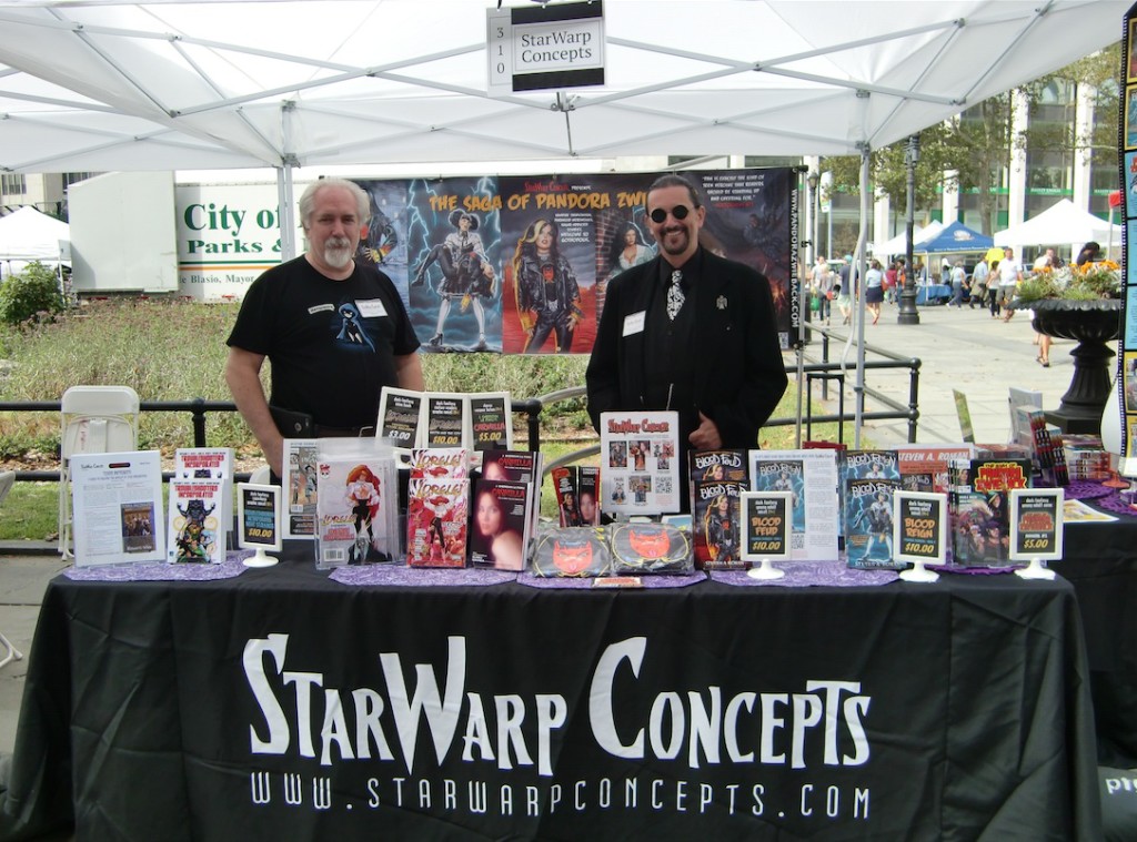
With the 2015 Brooklyn Book Festival being held this Sunday, and with StarWarp Concepts as one of its exhibitors, I thought the timing couldn’t be better to remind book lovers just what The Saga of Pandora Zwieback is about. And what better way to accomplish that goal than to run the guest post/short promotional story that I originally wrote for the online magazine Writing Belle, back in May? If you missed it the first time around, allow me to introduce you to:
“Pandora Zwieback and the Bloggy Thing”
A Gothy Tale of Self-Promotion by Steven A. Roman
“A guest post? I don’t know how to write one of those things!”
 Pandora Zwieback crossed her arms and sat back as she stared in frustration at her laptop’s screen, as though the computer would have any better luck in coming up with the words that eluded her, but the machine only stared blankly back at her. It was so frustrating. Stupid computer.
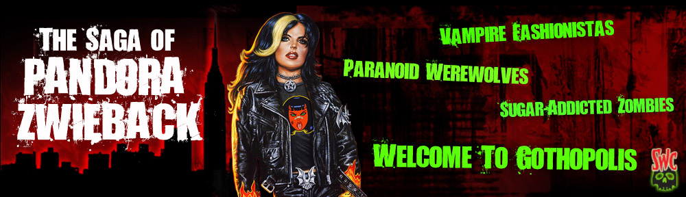
Pan sighed. When Omaima Ramiya, the managing editor of the Society of Classic Monsters website, had first contacted her, she’d thought the woman really wanted to talk to her dad, David, who owned Renfield’s House of Horrors and Mystical Antiquities—after all, Renfield’s was the only horror-themed museum in the New York borough of Queens; wouldn’t it make sense to interview its director? He would’ve known what to write about. But no, Ms. Ramiya was more interested in learning about the teenaged Goth with the supernatural gift that allowed her to see through the human disguises worn by the creatures of the night that really existed in the world. Although initially shocked that anyone outside her parents and immediate circle of friends was even aware she possessed “monstervision” (as Pan called it), it all became clear when Ms. Ramiya explained that it was their mutual friend Annie who’d put her in touch, Annie suggesting that SoCM’s visitors might be interested in learning about her adventurous young friend.
 Annie: otherwise known as Sebastienne Mazarin. An immortal, shape-shifting monster hunter who’d spent the last four hundred years protecting the world from the vampires, werewolves, and whatevers that stalked the shadows in search of human prey. Annie was currently acting as Pan’s mentor, helping the girl in trying to understand the strange powers she possessed.
Standing behind Pan, Sheena McCarthy leaned over to rest her chin on the top of her best friend’s head, and peered at the blank screen. “Y’know, if you’re waitin’ for that thing to write it for you, you’re gonna be waitin’ a looong time, Zee.”
Pan hmmf’d. “Well, it’s not like I can think of anything to say, Sheen. I mean, how do you tell the whole world that before Annie came along, I’d spent the last ten years being diagnosed as a paranoid schizophrenic because I’ve been seeing monsters since I was six—and I don’t even know why I started seeing them in the first place? Or that Annie was the one who proved to me and my parents that I’d never had a mental illness to begin with, that this weird monstervision is some kinda superpower I’ve been gifted with for whatever reason—”
“Not to mention that other power, the one that lets you heal faster from wounds and stuff, like a gothy Wolverine from the X-Men.”
“Yeah, I don’t know where that’s coming from, either.” It was a pretty cool power, though—not only did it help her recover quickly from some of the scrapes she found herself in, but she could also use it to fix other people’s injuries. So, less like Wolverine and more like a walking first-aid kit. But it sure did come in handy—some of the damage she’d taken from monsters she’d faced could have turned out downright lethal without that healing factor.
 “So just write all that stuff down,” Sheena said. “I don’t see what’s the big deal. I thought you were supposed to be the big Renaissance woman: writer, artist, monster fighter”—she flashed a wicked little smile and wrapped her arms around Pan’s shoulders—“loooverrr…or at least that’s what I’m figurin’, what with you makin’ googly eyes at your boyfriend Javier all the time.” A tiny grunt of annoyance slid past her lips as she released her friend, before taking a seat on the corner of Pan’s bed. “Still don’t think it’s right, you datin’ a Yankees fan when you’re a die-hard Mets fan like me, but I guess I’ll just have to learn to live with that unholy alliance.” She sighed dramatically.
Pan frowned at Sheen’s reflection in the monitor. “Quiet, you. And yes, you will have to learn to live with it. Now shut up and help me write this thing.”
Sheen thought it over for a few seconds. “Okay, how about this? ‘My name is Pandora Zwieback. I’m a sixteen-year-old Goth chick with the power to see every monster and ghoul out to raise a little hell in my New York City hometown. But with the help of an immortal monster hunter named Annie, I’m gonna protect the city and the world from the forces of darkness…and maybe even have some fun doing it! This is…The Saga of Pandora Zwieback!’ Whattaya think?”
Pan made a gagging sound and rolled her eyes. “That is awful. It sounds like some kinda lame-ass TV show introduction.”
Sheen grinned. “I totally cribbed the style off’a The Flash and iZombie.”
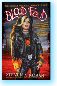
Pan shrugged. “I’ll take it.” She scooted her chair up to her desk and started typing. “Should I work in that there’s a Saga of Pandora Zwieback young adult novel series about me, published by StarWarp Concepts? The one written by the guy who did those X-Men: The Chaos Engine Trilogy and Final Destination novels?”
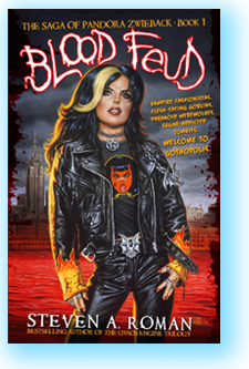
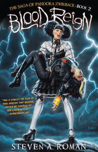 “What, that Steven A. Roman dude? Oh, hells, yes! I mean, you’re supposed to be gettin’ royalties from those things, aren’t you? ’Cause it’s your life he’s writin’ about.” Pan nodded. “So yeah, then do a little pimpin’ and let folks know there’re two books out already: Blood Feud and Blood Reign, and they’re about you and me and Annie and Javi and your mom and dad gettin’ pulled into that crazy vampire war, with all those clans from around the world that were lookin’ for some kinda secret weapon that would help ’em take over the world.”
“Uh-huh. Only it turned out the ‘secret weapon’ was really the skeleton of a fallen angel named Zaqiel who’d tried to wipe out humanity, like, a couple hundred years ago. And the one who’d stopped him back then was Annie. But eventually his skeleton wound up at my dad’s museum, where all the vampires showed up to fight over it.” Pan swallowed nervously. “And then things went…really bad…”
She shook her head to dispel the disturbing memories. “Should I put in that critics have been going crazy over the books?” That had surprised her even more than a publishing company making an offer to tell her story, that there were people who weren’t just interested in reading about her, but that their online reviews of both Blood Feud and Blood Reign had been so enthusiastic and full of praise. It was kind of embarrassing, in a way—especially when she’d learned that StarWarp Concepts had christened these readers “Panatics” (ugh)—but she had to admit the ego boost was pretty sweet. No one had ever considered her a role model before; hell, she’d never considered herself a role model before. It was a…nice feeling.
“Rave reviews?” Sheen replied. “Sure. Throw it all in. Give ’em the hard sell, like my dad would say. Be totally shameless.”
“Yes, ma’am,” Pan said with a grin. Now that Sheen had given her a starting point, even if she had sort of swiped it from TV shows, and they’d talked it out, the writing was becoming a little easier. She still felt odd talking about herself this way, though. Pan chuckled. “Me, writing a guest post about a book series that’s about me. I don’t think you can get any more meta than that.”
“You could, if you were in a movie, writin’ a short story about how you were writin’ a guest post about a book series that’s about you. That would be, like, totally mind-blowin’.”
Not as mind-blowing as hunting monsters alongside her friends and an immortal shape-shifter, Pan thought with a smile. And her adventures were only beginning…
Written by Steven A. Roman and published by StarWarp Concepts, Blood Feud: The Saga of Pandora Zwieback, Book 1 and Blood Reign: The Saga of Pandora Zwieback, Book 2 are currently available for order from online and brick-and-mortar bookstores, and in e-book formats from Amazon.com, Barnes & Noble, iTunes, Kobo, Scribd, and Oyster Books. For more information, as well as sample chapters and sales links, please visit www.starwarpconcepts.com.
The Saga of Pandora Zwieback™ and © 1998, 2015 Steven A. Roman and Uriel Caton. “Pandora Zwieback and the Bloggy Thing” © 2015 Steven A. Roman.
 As you’re probably well aware by now (especially if you look at the previous post on this blog), I made an appearance on the late-night radio show Destinies: The Voice of Science Fiction, on Friday, October 2. Normally a half-hour show, it turned into a ninety-minute extravaganza thanks to WUSB’s overnight deejay taking the night off, which allowed host Howard Margolin and I to chat in length about the origins of Pandora Zwieback and her monster-hunting mentor, Annie; my years as a fiction editor and editor-in-chief for publishing house ibooks, inc.; my recurring feature “Tales of Development Hell” at the StarWarp Concepts blog, detailing licensed writing projects of mine that never made it to completion; and a few other topics. I had a great time doing the show.
 The Saga of Pandora Zwieback
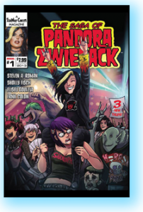
 Just a reminder: Steven A. Roman (that’s me), author of the popular dark-urban-fantasy series The Saga of Pandora Zwieback, will be appearing live on the radio show
 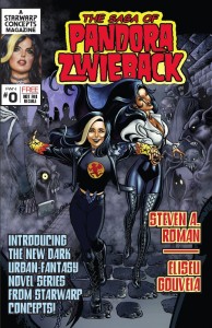 Review time! Over at the site The Gothic Library, gothic librarian (and site owner) Julia—who stopped by the StarWarp Concepts booth at this year’s Brooklyn Book Festival—gives her thoughts on the free comic The Saga of Pandora Zwieback #0, and recommends it to her readers. You can check out her review by
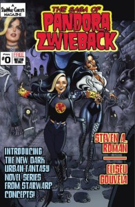