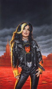
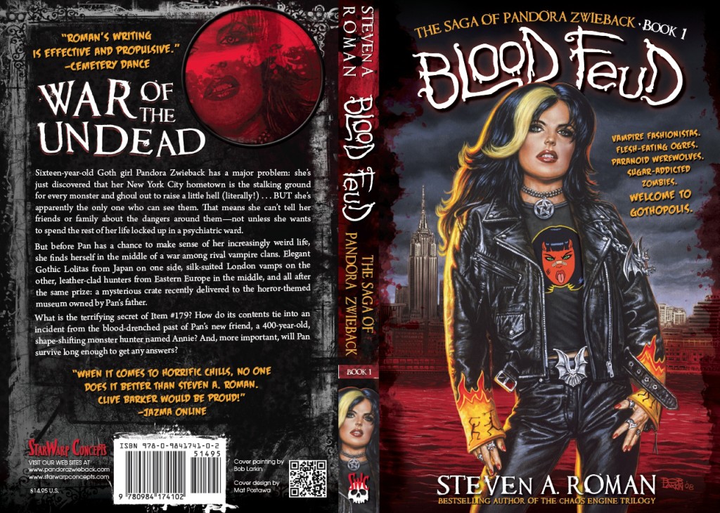
As you’ll recall, yesterday I was telling you the story behind the cover for what became a revitalized StarWarp Concepts’ first release in 2010: the promotional giveaway The Saga of Pandora Zwieback #0, which was intended to introduce readers to Pan and her forthcoming literary debut in the novel Blood Reign. I’d scripted the seven-page story in which Pan would speak directly to readers, leading up to a sales pitch for Blood Feud that required Pan to hold up a copy of the book (the cover for which would be digitally inserted).
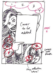 But when the artist I’d hired, Eliseu “Zeu” Gouveia, e-mailed his pencils for the story, the sales-pitch page had been replaced with an image of Pan and her monster-hunting mentor, Annie, gleefully running through a gauntlet of monsters. A revision would be necessary—which meant it was time to break out a marker and sketch what Pan was supposed to be doing, so Zeu would have a clearer understanding of my intention with that page.
What you see here is just…tragic. There’s a reason I focus more on my writing than my drawing. 😀 But it was good enough to show Zeu what I was looking for, and you’ll find the final version of page 6 in the comic. As for what to do with the rejected page…
“Y’know what?” I wrote to Zeu. “Don’t trash those pencils—because I think we’ve got our cover art here!”
That’s right—it might not have been the page I was looking for, but it turned out to be the perfect cover image! So I told Zeu to ink the piece, and soon enough I was looking at this:
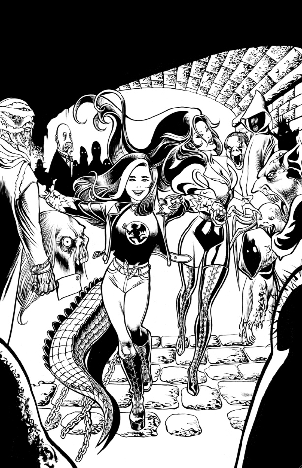
Perfect! And when I gave him the go-ahead to color it, this was the result:
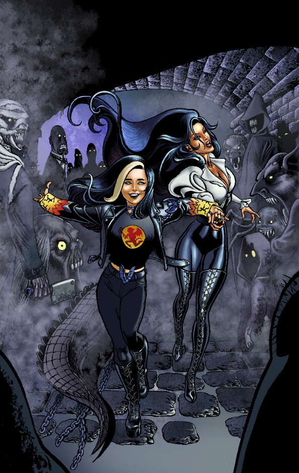
Now that’s cover art! The next step was to involve the comic’s designer and letterer, Mike Rivilis, a talented book designer I used to work with back in my editorial days at ibooks, inc. and Byron Preiss Visual Publications. (For SWC, he also designed and typeset the illustrated classic Carmilla, designed the graphic novel Troubleshooters, Incorporated: Night Stalkings, and designed and lettered the graphic novel Lorelei: Sects and the City and The Saga of Pandora Zwieback Annual #1.) I explained to Mike what the comic was for, and what design elements were needed—like lettering the seven-pager and typesetting sample chapters from Blood Feud in the back of the comic—and I gave him a rough idea of how the front cover should turn out.
There was one thing missing, though: a Saga of Pandora Zwieback logo. For the Pan novels, designer Mat Postawa simply has the series title arc across the front cover, in a traditional font, and hand-draws the titles. The comic, however, would require an actual title treatment. So I turned to the one artist I knew who had decades of experience in creating comic and book titles: Bob Larkin, cover painter of the Pan novels Blood Feud and Blood Reign. I wanted an old-style horror logo, so I sketched out what I had in mind and explained to Bob that I was looking for something along the lines of the lettering styles used for articles in the classic horror magazine Famous Monsters of Filmland and the logos of Marvel horror comics of the 1970s:
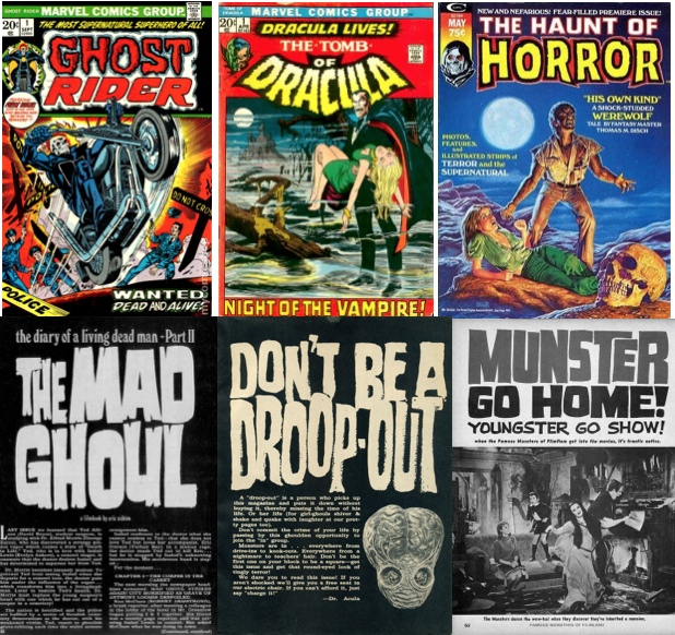
Not surprisingly, he immediately understood what I was looking for—we’re both old-school horror fans (that Haunt of Horror cover painting is one of Bob’s, in case you hadn’t guessed)—and a day or two later he sent over his take, which I thought was perfect. I forwarded it to Mike, who was just wrapping up his design and lettering work on the comic’s interiors, and soon enough we had a finished cover:
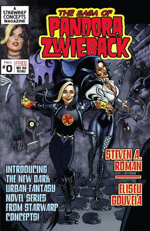 Nice, huh? And it all started with the happy accident (as the late painter Bob Ross would say—we don’t make mistakes, we have happy accidents) of Zeu drawing the wrong image for the Blood Feud sales-pitch page. It’s great when things just work out, isn’t it?
By the way, The Saga of Pandora Zwieback #0 is still available for free download—I ran out of print copies a few years back—so just click on the cover link you see in the right-hand sidebar and snag your own copy of this (now) digital comic.

 Back on June 1st