Last week, I covered the importance of having an editor involved in the creative process of writing a book’s manuscript, in a trio of posts found here, here, and here. But that’s just one part of what’s involved in putting together a novel for publication. Today, we start talking cover design.
Good stories are always essential, but from a sales point of view, one of the most important aspects of publishing is the cover. It’s the first thing a potential reader is going to see in a brick-and-mortar bookstore (unless it’s displayed spine-out on their shelves) or at an online retailer’s site, so it’s absolutely imperative that the cover be as eye-catching and intriguing as possible. The vast majority of small-press and self-published books often fail in that regard, choosing the laziest, most god-awful type-and-image designs they can throw together: photographs or paintings (or worse, silhouetted figures) that have nothing to do with the story; lettering taken straight from their computer’s font libraries; titles that are too long, or extremely pretentious, or head-scratchingly vague. (Truth be told, I’ve seen my fair share of books released by mainstream publishers that take the same approach.)
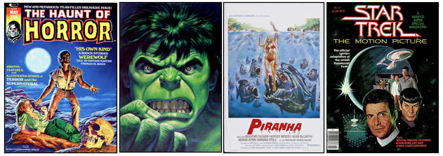
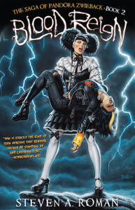
So in 2010, when it was time to transform StarWarp Concepts from a comic publisher to a book house, I knew that Job Two would involve using professional artists and designers to provide eye-catching covers (Job One was having quality stories to publish; can’t have the second without the first). The first person I approached was Bob Larkin, whose amazing cover paintings for Marvel Comics (Dazzler, Haunt of Horror, Vampire Tales, The Hulk!, Savage Sword of Conan the Barbarian, Crazy) and Bantam Books’ Doc Savage pulp-fiction reprints had created a fan base that included such luminaries as Alex Ross, Joe Jusko, John Romita Sr., Jim Steranko, and Larry Hama. I’ve been a fan myself, all the way back to the ’70s, and was thrilled when, in 2000, he agreed to paint the covers for my X-Men: The Chaos Engine Trilogy novels—and overjoyed when he did three cover paintings for SWC’s succubus character, Lorelei. This time, however, I wanted him to paint the covers for a series about a certain teenaged Goth chick.

Explaining the gothy nature of Pan took a bit of doing, since it’s outside the range of anything Bob had ever painted before, but he had two advantages going in to the project: Pan had already been designed by my creative partner, Uriel Caton; and Bob has an extensive history of painting horror-related images, from monster magazine covers for Marvel and Warren Publishing to monster movie posters for New Line Cinema, United Artists, and Troma Films (among other studios)—Piranha, Night of the Creeps, Humanoids From the Deep, and The Toxic Avenger II are just some of the poster images he’s created.
But why use painted covers? you ask. Why not go with a photograph of a model dressed as Pan? That’s what all the major publishers would do. And that’s the problem, because when all the major publishers do the same thing, they create a uniform look for an entire genre of books that’s extremely generic and boring. (To get an idea of what I’m talking about, check out this post about photo covers that I wrote back in 2011.) I wanted Bob Larkin originals for Pan’s series, and that’s exactly what I was gonna get. All I needed to get the process started was to show Bob what I had in mind…
Next: Creating the cover for Blood Feud, the first novel in Pan’s saga.
 This just in: It’s been confirmed that StarWarp Concepts—publishing home of The Saga of Pandora Zwieback and a host of other great novels, graphic novels, and comic books—will be the cover feature of IndyFest Magazine #85, coming this June!
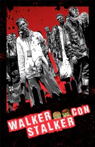
 The latest edition of New York and New Jersey’s zombie-tastic Walker Stalker Con returns to New Jersey’s Meadowlands this December, and StarWarp Concepts will be making its debut appearance there!
 Stop the presses! The promotional tour for