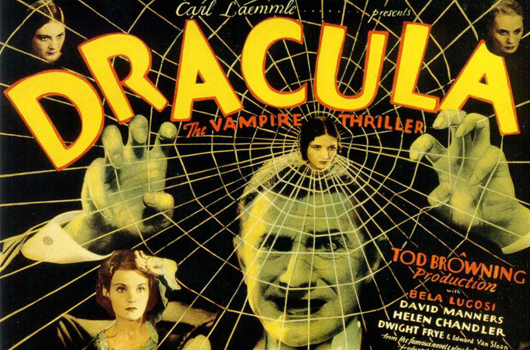
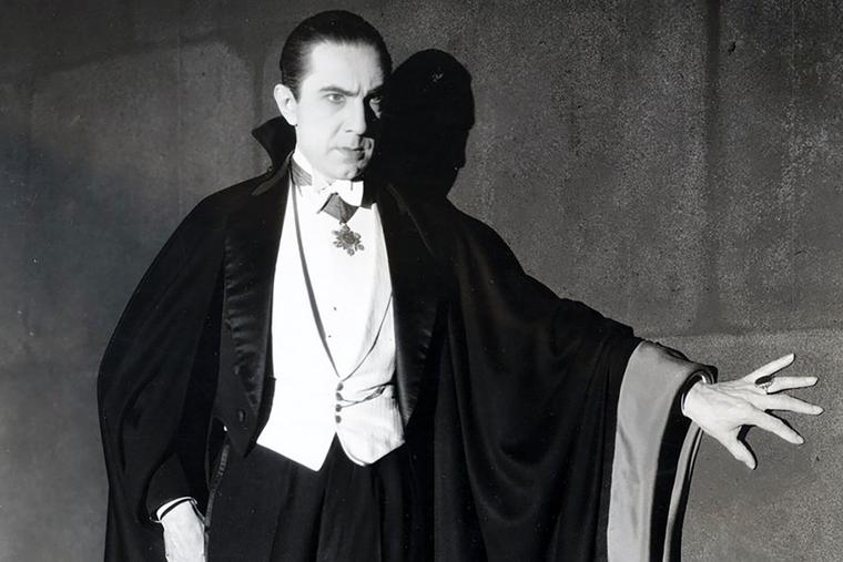
Hey, lovers of vampire fiction and supernatural romance, did you know that it was 95 years ago—on Valentine’s Day, of all days!—that the 1931 screen adaptation of Dracula made its theatrical debut? It’s true!
Directed by Tod Browning (Freaks, London After Midnight), with a screenplay by Garrett Fort (adapting the Bram Stoker novel and the then-popular stage play written by Hamilton Deane and John L. Balderston), and starring Bela Lugosi as the count, Dwight Frye as his crazy minion Renfield, Edward Van Sloan as Van Helsing, David Manners as John Harker, and Helen Chandler as Mina Seward, the film proved to be a major box-office success and made Lugosi a household name.
Still, it’s not really a romance—Dracula’s interest in Mina is more along the lines of a predator stalking its prey than a love story; he’s a monster in human form. But maybe it works in a tainted love, psycho-stalker, Lifetime Movie sort of way? Whatever it is, and however you look at it, you do you, Cupid…
So, what’s the best way to celebrate this special Valloween occasion if you’re a horror fan? Well, you could read Dracula, of course, or have your own movie marathon of horror flicks starring the count, starting with the Bela Lugosi classic (or the Spanish-language version, released the same year, starring Carlos Villarias and using the same sets!) and leading all the way up to the most current screen adaptation, Dracula, written and directed by Luc Besson (The Fifth Element), and starring Caleb Landry Jones and Zoe Bleu as the count and his love interest, Mina Murray.
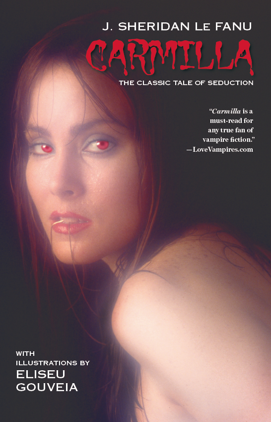
Or you could purchase a book that helped to inspire Bram Stoker in creating the count’s unforgettable debut—especially when it came to the presentation of his vampirie “brides.” In fact, it’s been ranked a “Best of #BookTok” title!
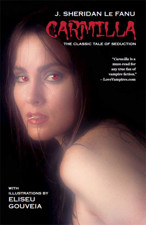
Carmilla is J. Sheridan Le Fanu’s 19th-century classic vampiric tale of love gone wrong. Laura is so desperate for a friend that when a young woman named Carmilla practically turns up on the doorstep of the castle owned by Laura’s father, she thinks her prayers for companionship have been answered. But as she comes to realize, Carmilla isn’t as interested in making friends as she is in spilling blood…
Regarded as the one of the earliest female vampire tales—if not the first—Carmilla was an influence on Stoker’s Dracula, and remains a popular character in fiction to this day. Our special Illustrated Classics edition contains six exclusive illustrations by the super-talented Eliseu Gouveia (Lorelei: Sects and the City, A Princess of Mars, The Saga of Pandora Zwieback Annual #1).
“With a cover that looks like it belongs on the paranormal romance shelf in a bookstore and half a dozen illustrations provided by Eliseu Gouveia, this edition stands a good chance of tempting some younger readers to pick up this classic vampire tale…. I wish I’d picked this book up in seventh grade instead of slogging through Dracula.”—The Gothic Library
Carmilla is available in print and digital formats. Visit its product page at StarWarp Concepts for ordering information.

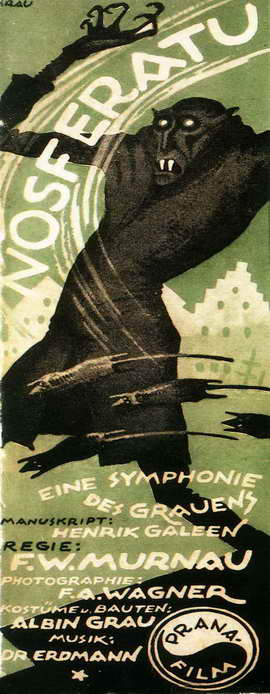 Okay, I’m a day late in celebrating it but yesterday, March 4, was the 95th anniversary of the day in 1922 when German movie-going audiences were introduced to, and horrified by, Count Graf Orlok, the vampiric star of director F.W. Murnau’s

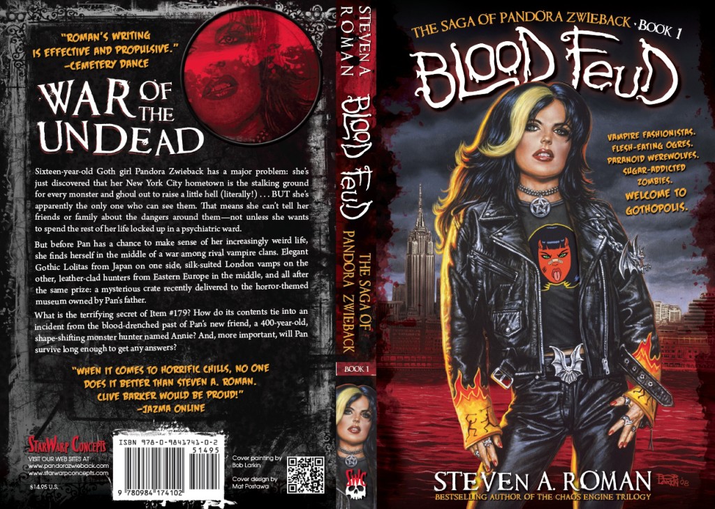
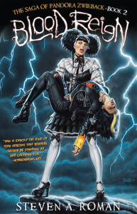
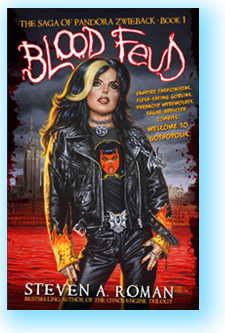 Speaking of vampires and blood wars, are you familiar with my young adult novel series
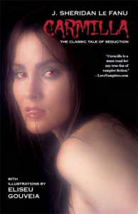 And if your prefer your vampires less action-oriented and more Gothic, then let me direct you to
  Back on June 1st